Chapter 3 - CSS Style
Displaying a web page is the primary function of a web browser. We saw in chapter 2 that this is done from the page's HTML code. The browser retrieves the HTML code of a web page (text), converts it into a tree (the DOM) and builds the image that will be displayed on the screen by placing the nodes of the tree in boxes (painting).
To perform the painting, the browser must make choices about the graphical properties of the elements to display. For example, it must choose the font, the colors, and the sizes and positions of the boxes.
All graphical properties have default values defined by the standards. For example, the default font is usually a serif font such as Times, the background color is transparent, and images are displayed in boxes lined up one after the other.
These default values are often unsuitable for the rendering you want. You then need to be able to change them. This is what CSS (Cascading Style Sheets) is for.
This chapter presents CSS. It explains the concepts of graphical property and style rule. It describes the mechanism that associates a style with an HTML element. Finally, it ends by explaining how boxes are positioned during painting.
HTML and CSS
HTML and CSS are two complementary standards for building web pages. HTML defines the markup language and the structure of a web page (the content). CSS defines the style of a web page (the presentation).
The style of a web page must be linked to the page's HTML code. One way to do this is to use the <style> tag in the page's HTML code and put the whole style inside it (see Code 3.1, lines 6 to 13). This approach defines the structure of the web page and its style in a single resource (the HTML code). The drawback is that presentation is mixed with content. Moreover, the style is tightly bound to a single web page, so it cannot be reused by other web pages.
<!DOCTYPE html>
<html lang="en">
<head>
    <meta charset="UTF-8">
    <title>CSS Style</title>
    <style>
        body {
            color: yellow;
            background-color: black;
            text-align: center;
            border-style: solid;
        }
    </style>
</head>
<body>
    <h1 id="top">Style <span class="keyword">CSS</span></h1>
    <p>Displaying a web page is the primary function of a web browser.</p>
    <h1>HTML and CSS</h1>
    <p>The <span class="keyword">CSS</span> language...</p>
</body>
</html>
Code 3.1: HTML code embedding a CSS style.
We prefer to define a CSS style sheet as an independent resource (often a file on the web server) and to use the HTML <link> tag to link this resource to the HTML code (see Code 3.2, line 6). This approach lets several web pages of a website share the same CSS style.
<!DOCTYPE html>
<html lang="en">
<head>
    <meta charset="UTF-8">
    <title>CSS Style</title>
    <link rel="stylesheet" href="/style">
</head>
<body>
    <h1 id="top">Style <span class="keyword">CSS</span></h1>
    <p>Displaying a web page is the primary function of a web browser.</p>
    <h1>HTML and CSS</h1>
    <p>The <span class="keyword">CSS</span> language...</p>
</body>
</html>
Code 3.2: HTML code linked to a CSS style.
Graphical properties
The CSS style of a web page gives values to graphical properties. For example, a style can specify that the page's background color is black, that the font of the headings (<h1> tag) is Arial, and that all images have a red border.
A CSS graphical property is defined by its name and by the values it can take. For example, the background-color property defines the background color. It can take the following values: red, green, blue, yellow, etc. (a color can also be given in hexadecimal notation).
CSS defines about 200 graphical properties. In the next sections of this chapter we will list some widely used CSS graphical properties, but our goal is not to describe them all. For now, to illustrate CSS concepts with simple examples, we will only use the following five graphical properties:
- color: text color (red, green, blue, yellow, etc.),
- background-color: background color (red, green, blue, yellow, etc.),
- text-align: text alignment (left, right, center, justify),
- border-style: style of the box border (none, hidden, dotted, dashed, solid, double, groove, ridge, inset, outset, inherit),
- font-size: font size (in pixels).
CSS rules and CSS selectors
A CSS style defines values for graphical properties, but above all it specifies which nodes of the DOM tree these values must be applied to. Indeed, you rarely want to give the same graphical property to every node of the DOM tree. Most of the time, you want to change the color of part of the text, align a heading to the left, center a button, etc.
The CSS standard offers the concept of a CSS rule, which groups a set of values for graphical properties and specifies which nodes of the DOM tree these values must be applied to. Nodes are selected using what the CSS standard calls a CSS selector. A CSS style sheet is therefore a list of CSS rules, where each rule defines a CSS selector and a set of values for graphical properties. For example, the CSS style sheet in Code 3.3 defines four CSS rules. Syntactically, each rule starts with the selector, then lists the graphical properties and their values.
p {
    color: yellow;
}

.keyword {
    color: red;
}

#top {
    text-align: center;
}

body {
    color: white;
    background-color: black;
    border-style: solid;
}
Code 3.3: CSS style with four rules.
A CSS selector is an expression that selects one or more nodes of the DOM tree. There are four main ways to select nodes in a DOM tree: by tag, by class, by identifier or by attribute.
Selecting by tag means giving the name of a tag and selecting every node of the tree with that tag. The first and fourth rules of Code 3.3 use this selection method. The first rule uses the selector p, which selects every node of the DOM tree whose tag is <p>. This rule specifies that the text color must be yellow. This means that all paragraphs (<p> tag) will be displayed with yellow text.
Selecting by class means giving the name of a CSS class and selecting every node of the tree with that class. In HTML, tags can be associated with one or more CSS classes; you just specify them in the class attribute. The web page developer invents their own classes, with whatever names they like. Note that there are no predefined classes. For example, Code 3.2 uses the class keyword for the <span> tag (lines 9 and 12).
In CSS, to define a rule that selects by class, you use the "." character to indicate that it is a class (line 5). For example, the second rule of Code 3.3 uses the selector .keyword, which selects every node of the DOM tree whose class is keyword. This rule specifies that the text color must be red. This means that the text of all tags with the class keyword (not just <span> tags) will be displayed in red.
The third way to select nodes is to use tag identifiers. Indeed, you can give a unique identifier to any tag of a DOM tree. This is done with the tag's id attribute. Here again, the developer invents the identifiers for the tags they choose (and must make sure they are unique). Code 3.2 defines the identifier top for the <h1> tag (line 8). The third rule of Code 3.3 uses the selector #top, which selects the node of the DOM tree whose identifier is top. Syntactically, the CSS style sheet uses the hash sign ('#') to indicate that it is an identifier (line 9). This rule specifies that the text of the tag whose identifier is top will be centered.
The fourth way to select nodes uses the values of tag attributes. For simplicity, we do not describe this selection method, which is less commonly used than the other three.
These selection methods (tag, class, identifier, attribute) can be combined using combination patterns. The CSS standard offers about sixty patterns for defining more precise selectors. Here are a few frequently used patterns:
- p.class: selects every node of the DOM tree whose class is class and whose tag is
<p>, - div,p: selects every node of the DOM tree whose tag is
<div>or<p>, - div p: selects every node of the DOM tree whose tag is
<p>and that is contained in a node whose tag is<div>, - div > p: selects every node of the DOM tree whose tag is
<p>and that is a child of a node whose tag is<div>, - a:hover: selects every node of the DOM tree whose tag is
<a>when the mouse hovers over it.
Applying CSS rules
The process of displaying a web page changes slightly when CSS style sheets are used. The browser must download all the CSS sheets linked to the HTML before it can start painting. Note that painting cannot start until all the style sheets have been downloaded. To speed up display, it is recommended to keep style sheets small and even to bundle them into a single resource.
Once the style sheets have been downloaded, the browser must assign the graphical properties to the DOM elements. It does this by building a new tree (the CSSOM) that adds the values of the graphical properties to the DOM. This is the tree used for painting. Figure 3.1 shows this process.
The CSSOM is built by traversing the DOM from its root to its leaves. For each node visited, the browser finds the CSS rules that apply to it (thanks to the CSS selectors), then copies the values of the graphical properties into it. In our example (see Code 3.2 and Code 3.3), considering the <body> tag, which is the first one visited, we see that only rule 4 applies to it. The graphical properties of rule 4 are therefore copied onto this node.
Since several rules can apply to the same node, there may be conflicts if at least two rules define different values for the same graphical property. To resolve conflicts, CSS computes a priority score (called specificity) for each rule. This score is represented as a three-dimensional vector: [#id, #class, #tag]. The first dimension counts the identifiers used by the selector. The second dimension counts the classes used by the selector (a selector can use several classes, thanks to combination patterns). The third dimension counts the tags used by the selector (a selector can use several tags, thanks to combination patterns). With these vectors, you can compare rules and determine which one has the highest priority. Note, however, that it is possible (though strongly discouraged) to define a CSS rule directly in HTML tags (by defining the style in the tag's style attribute). Such a rule takes priority over all the others.
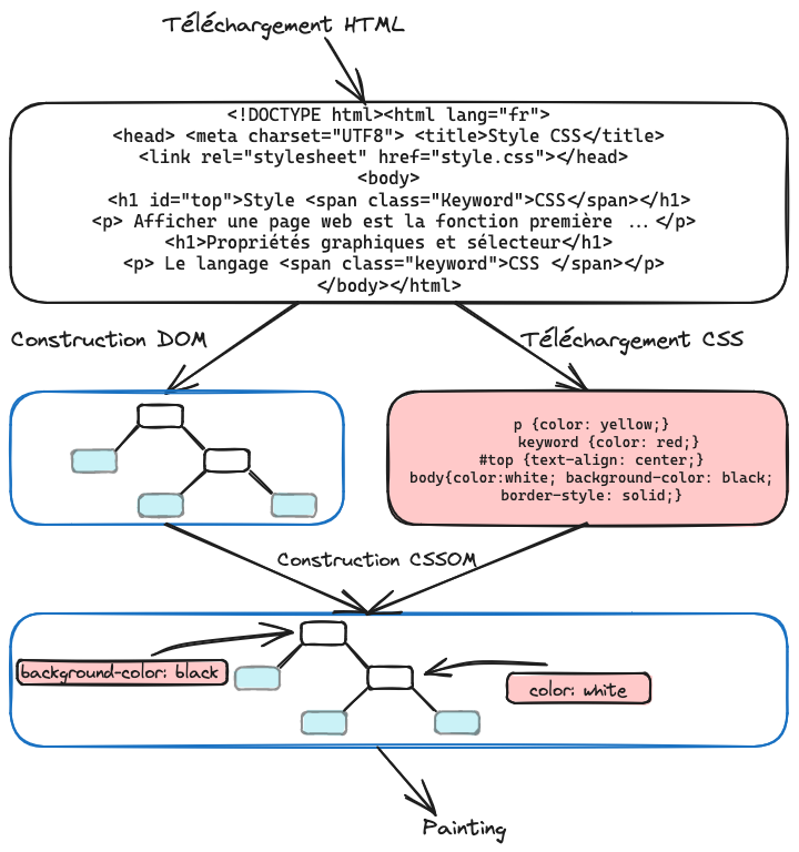
Figure 3.1: The process of displaying a web page linked to a CSS style sheet.
In our example, rule 1 and rule 2 define different values for the color property. Suppose the HTML code contains the tag <p class='keyword'>: these two rules will then conflict. Computing the scores, we see that rule 1 has a priority score of [0, 0, 1] (0 id, 0 class and 1 tag) and rule 2 has a priority score of [0, 1, 0] (0 id, 1 class and 0 tag). Rule 2 therefore has a higher priority than rule 1, and the value red will be copied.
Before visiting the next node and continuing to build the CSSOM, the values of the node's graphical properties are passed down to all its children (for inherited properties such as color). This mechanism helps explain the letter C of the acronym CSS: Cascading. Indeed, graphical properties are propagated from the root of the DOM to its leaves (they flow down like a cascade).
Boxes and CSS
Painting consists of displaying the DOM elements on the screen. To do this, the browser assigns a box to each element and then lays out the boxes relative to one another. We saw in chapter 2 that box layout depends on the nature of the tag (see Chapter 2, Table 2.1). We also saw that the browser makes boxes take the space they need to display their content, and no more. Here again, CSS lets you change this default behavior.
The display graphical property specifies how boxes are laid out, both with respect to their inner content and with respect to the other boxes around them. There are about twenty basic values for this graphical property, and they can be combined to obtain more complex behaviors. For simplicity, we only present the most basic values here:
- none: the box is not displayed. This value is used to hide a box.
- block: the box is displayed as a block, meaning it takes the full available width and is neither preceded nor followed by another box on the same line.
- inline: the box is displayed as an inline element, meaning it only takes the space needed to display its content. The preceding or following sibling elements in the DOM are displayed next to this box (unless they are display:block).
- inline-block: the box is displayed as an inline element, but it can have a defined width and height.
For example, Code 3.4 shows how to use the display property on <img> tags. By default, <img> tags are inline elements that behave like inline-block: images are displayed one after the other, but you can specify their width and height. Code 3.4 includes a style sheet (lines 6 to 10) that replaces this default value with block. This means the images are displayed one below the other (see Figure 3.2).
<!DOCTYPE html>
<html lang="en">
<head>
    <meta charset="UTF-8">
    <title>My Images</title>
    <style>
        img {
            display: block;
        }
    </style>
</head>
<body>
    <h1>My Images</h1>
    <img src="image1" width="200"/>
    <img src="image2" width="200"/>
    <img src="image3" width="200"/>
</body>
</html>
Code 3.4: Using the display property on images.
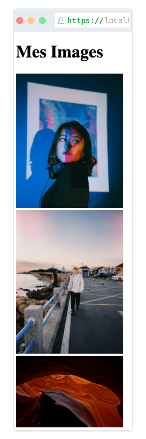
Figure 3.2: Several images with display block (the images are stacked one above the other).
Note that the position and float graphical properties change the layout of boxes. Without going into detail, the position property gives a box a fixed position, while the float property makes it float. Note also that the column-count graphical property splits the content of a box into several columns of equal size.
Finally, the width, height, margin, border and padding graphical properties define the width, the height, the outer margin, the border and the inner padding of a box. Figure 3.3 shows the different areas that make up a box. These graphical properties are often used to create space between boxes and thus improve the readability of web pages.
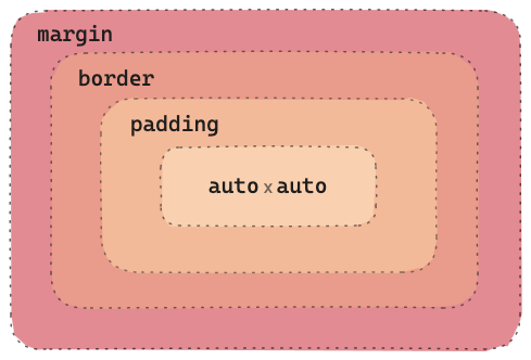
Figure 3.3: Inner structure of a box.
Media queries
CSS lets you change the style depending on the screen size, thanks to the media query mechanism. A media query is a general mechanism that can target different types of media (screen, print or all) and takes into account various characteristics of the media (its size, the number of colors supported, etc.).
The goal here is not to cover this mechanism in full, but to show how it can be used to change the appearance of a web page depending on the size of the user's screen. This makes it possible, in particular, to have a different appearance on a mobile phone screen (small screen) and on a computer screen (large screen). For example, Code 3.5 shows media queries with three screen sizes. For each screen size, the style sheet gives a different value for the column-count property of the main container, whose CSS identifier is main-content. Thanks to this style sheet, the main container will be split into three columns on large screens, two on medium screens and a single column on small screens.
@media screen and (min-width: 300px) {
    #main-content {
        column-count: 1;
    }
}

@media screen and (min-width: 600px) {
    #main-content {
        column-count: 2;
    }
}

@media screen and (min-width: 1200px) {
    #main-content {
        column-count: 3;
    }
}
Code 3.5: Example of rules with media queries.
This chapter presents the CSS standard. Remember the following three points:
- A style sheet lets you change the default values of graphical properties. It is associated with the HTML code of the web page.
- The values of graphical properties are grouped into CSS rules. Each rule has its CSS selector, which defines the elements the rule applies to.
- The values of graphical properties are assigned by building the CSSOM from the DOM. There are several priority rules to determine the final value of a graphical property. The resulting values are passed down in cascade to the children of each node.
Practice
Review questions
What is a CSS style sheet?
- a) A style used to position the graphical elements of a web page.
- b) A set of rules that target DOM elements and change the default values of graphical properties.
- c) An HTML document that embeds fonts to change how text is displayed.
What is a CSS selector?
- a) An expression used to find one or more DOM elements.
- b) A database query used to find a graphical style.
- c) A selection of graphical styles applied to a web page.
What does the display graphical property mean?
- a) It changes the background color of images.
- b) It changes how display boxes are positioned relative to one another.
- c) It centers images.
How are the priorities of CSS rules computed?
- a) A three-dimensional vector gives the priority of each rule.
- b) The first rule of the style sheet has priority.
- c) The last rule of the style sheet has priority.
What is a media query?
- a) A CSS rule used to change the properties of media (videos, images, etc.).
- b) A query used to create animations when the page is displayed.
- c) A query used to apply CSS rules depending on the medium and its characteristics.
Answers: 1-b, 2-a, 3-b, 4-a, 5-c
Exercise 1 - CSS selectors
Here is the HTML code of a small web page.
<!DOCTYPE html>
<html>
    <head>
        <title>Images</title>
    </head>
    <body>
        <img id="logo" src="logo"/>
        <h1>My images</h1>
        <p>Here are my <span class="belles-couleurs">images<span> </p>
        <div>
            <img src='image1'/>
            <img src='image2'/>
            <img src='image3'/>
            <img src='image4'/>
            <img src='image5'/>
        </div>
    </body>
</html>
Using the HTML code of this web page, answer the following questions:
Which element(s) does the selector img select?
Which element(s) does the selector body img select?
Which element(s) does the selector #logo select?
Which element(s) does the selector .belles-couleurs select?
Which element(s) does the selector p > span select?
Propose a selector that selects the five images (not the logo).
Exercise 2 - CSS rules
Using the same web page whose HTML code is given above, answer the following questions:
Propose a CSS rule that makes the screen background black.
Propose a CSS rule that displays the heading (h1 tag) in red.
Propose a CSS rule that displays the five images one above the other.
Propose a CSS rule that displays the logo on its own line (even though it is followed by an h1 tag).
Exercise 3 - Conflicting CSS rules
Assume that the following style sheet is linked to the HTML code given above.
.belles-couleurs {
    color: red;
}

p > span {
    color: blue;
}
Answer the following questions:
On which element of the web page do these two rules conflict?
Explain how this conflict is resolved.
Project - Image wall
We will continue the web application that displays images (see Chapter 2, project). This web application must consist of the home page (index.html), the image wall (images.html), and one page per image (image1.html, image2.html, etc.).
You can see the expected result here.
Take the code you wrote in chapter 2 and copy it into a new directory named chap3-projet. Add a file style.css to this directory, as well as a file logo.png containing the logo of your choice.
- Modify the page index.html so that it looks like the following layout:
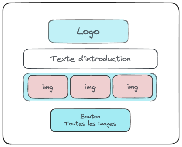
Figure 3.4: index.html
Here are the steps: - Add a centered logo (choose any logo you like) - Add a text area below the logo (write any text you like) - Add a banner with three images (the most recently added images). The images must be clickable. - Add a button to view the image wall (page images.html)
- Modify the page images.html so that it looks like the following layout:
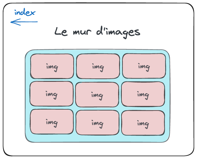
Figure 3.5: images.html.
Here are the steps: - Add a back button that returns to the index - Display a heading - Add the wall of thumbnails (three columns to display the images)
- Modify the image pages (image1.html, image2.html, etc.) so that they look like the following layout:
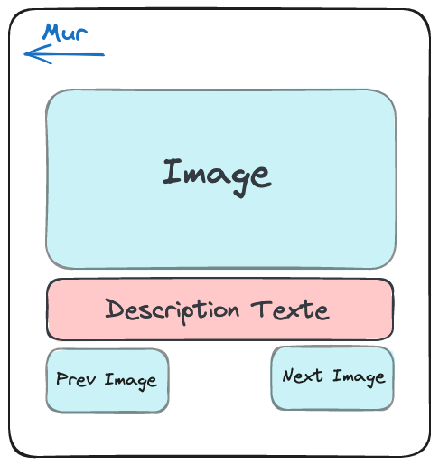
Figure 3.6: image.html.
Here are the steps: - Add a back button that returns to the wall - Display the image at a suitable size - Add a text area - Add thumbnails for the previous and next images
- Modify the CSS style so that the image wall displays five columns on large screens, three columns on medium screens and a single column on small screens. You can use the value 100% for the width property on the content of the columns so that the images fill the columns.